This is where I work. Remix.

A few weeks ago, LinkedIn held a "Pimp Your Row" competition, where each row of cubicles was given money for decorations. Our IT team ended up winning with their incredible Tron-themed night club and the pictures from the competition made that my second most popular blog post ever (you'll never guess #1). Today, the IT took it up a notch again with "Tron Remix": 2 bars, DJ's, live drummer, dance party, and a whole lot more. I can officially say I got paid to party.


Lights, sound and beer pong.
Mirrors, projectors, and music.
Two bars, dancing and LinkedIn's own Steve Johnson on the drums.


Beer pong. The ping pong balls glow in the black lights.


One of the bars


Your job posting sucks.

Silicon valley is in a talent war. Tech companies are battling to hire the top prospects like never before, with Google alone planning to add more than 6,000 people in 2011. They are also dishing out money left and right to retain employees, with counter-offers ranging from $500k to $3.5 million, and even $100 million! And yet, despite the incredibly high priority of hiring, companies like Google still waste their time with job postings like this:

Click for larger image

Looks like a normal job posting, right? What's so bad about that, you ask? Everything. Just about the whole thing, start to finish, is a waste of time. And this post isn't to pick on Google: just about every company does it: Facebook, Twitter and my own company, LinkedIn, all use the same types of job postings. In this blog post, I'm going to tell you why they are all wrong.

So many words. So little meaning.

Let's start with the obvious: most of the content in these job postings is absolutely meaningless. Here are some choice phrases pulled straight from the job postings mentioned above:
Results-oriented.
Work well both as part of a group and independently.
Strong communication and documentation skills.
Detail oriented with excellent written and verbal communication skills.
Now ask yourself a question: has anyone EVER looked at one of the phrases above and thought to themselves, "Communication skills? Nah, guess I can't apply." These are all vacuous phrases that your brain skips over as you read the job posting. They have no impact on the candidate one way or the other.

Clones

Dilbert.com


One of the difficulties in this talent war is distinguishing your company from the competition. In case you haven't noticed, all job postings look alike. Even if you skip over the meaningless phrases mentioned above, every job posting is still just a blob of boring text that rattles off requirements. The job posting for a "Software Engineer" at one company is indistinguishable from another: "5+ years of experience, BS/MS/PhD in CS, excellent programming skills in Java..." Considering companies spend millions of dollars on branding, their job postings remain remarkably uniform.

The me monster

Finally, the biggest problem of all: most job postings are are totally, utterly selfish. They are the ultimate "me monster" at the party, totally focused on what the company wants, what the company's requirements are, we must have this, we need that, don't bother applying if you don't have those. The candidate's needs and desires are almost totally forgotten. The vast majority of job postings describe the how and the who, but totally leave out why you'd ever want to apply there in the first place.

If you're fighting tooth and nail to fill job openings, this is kind of a big deal. Your job posting might contain some info an active job candidate is looking for - and even that is questionable - but it is totally useless to passive candidates. And that's a problem, because the vast majority of people are passive candidates and, by definition, are not looking for a job, or for that matter, a job posting.

Who exactly are you targeting with your job posting?


The ideal job posting

To figure out what the ideal job posting is, you have to ask one question: what is the candidate actually looking for? Of course, you've known the answer to this all along: everyone wants the opportunity to work on cool products, with smart people, and in a great culture. So the perfect job posting would do two things:
  1. Advertise the fact that your company is, in fact, hiring for specific positions. This should take no more than a few sentences: job title, location, very brief description.
  2. Show off everything you can about your brand to convince the candidate that your company is where they'd want to work.
Instead of filling the page with filler text and meaningless details, give me a glimpse of the products you build; tell me about the team and why they are the best at what they do; highlight the technologies involved and the tough problems you solve. In short: show, don't tell.

Some examples

Sadly, I've seen very few decent job postings on the web. Somehow, just about every company has been suckered into using this antiquated text-based method - a left over from newspapers and bulletin boards - and we have yet to move this part of the hiring process into the 21st century. Here are the few decent examples I've been able to find that are at least intriguing and, even as a passive candidate, might have caught my interest. They are far from perfect, but hopefully, will get you thinking in the right direction (click for a larger image):


If you know of an awesome job posting, let me know in the comments!

Why game mechanics won't save your crappy product

The other day, I was chatting with a LinkedIn product manager about a new app he is working on and I posed a "hard" question: what incentive would users have to use the app initially and on an on-going basis? Before the product manager had a chance to answer, someone nearby chirped in: "you should put in some game mechanics!" Sigh. This is not the first time I've heard this. "Game mechanics" have been all the rage the last few years. Everywhere you look - from foursquare, to yelp to Xbox - you can find badges, leader boards and reward systems. And while it is sometimes effective, most implementations are either totally useless, or worse yet, counterproductive.

In fact, the very idea that cramming "game-like" elements into a product is enough to attract users is misguided; the proposal of using "game mechanics" as the primary way to drive and maintain user engagement is a short road to failure. I think these misconceptions come from a lack of understanding of two key concepts:
  1. Gameplay psychology
  2. The role of game mechanics
Gameplay psychology

The first reason that game mechanics probably won't work for you is that you don't understand game mechanics. Before you go off and add a leader-board or badging system to your next product, please take the time to go through Sebastian Deterding's superb presentation "Pawned. Gamification and its discontents". I'm embedding it within this blog post as the presentation beautifully covers the many mistakes and misconceptions about what gameplay is really all about:


One of the key takeaways from this presentation is that most people don't understand motivation. Think of the most common game mechanics you see in most products today: badges, scores, and progress bars. foursquare has it, so it must work, right? Wrong. These "external rewards" are rarely effective because gamers and humans in general are typically not motivated by external factors, but rather by intrinsic ones. In fact, studies have shown that external rewards and pressures can often act as de-motivators. If you're not convinced, it would be well worth your time to watch Dan Pink's talk on The Surprising Science of Motivation.

The role of game mechanics

If you fail to grasp the key principle of motivation, your game mechanics have no chance of being effective. But even if you do get the mechanics right, there is still no guarantee of success. To understand why, you need to understand that game mechanics are not your core product (unless you are building a game, of course) and have no value in and of themselves. All they can do is act as a "multiplier", encouraging some existing behavior by increasing the behavior's value in the eyes of the user. If that value was originally zero, game mechanics won't help.

To put it another way, if you have a crappy product to begin with, gameplay will not save it. It doesn't matter how many badges, progress bars, leaderboards, achievement scores, or collectibles you add, if the user doesn't see any value in your product, you will not be successful. Moreover, the more obvious the value proposition, the less you need to bother with game dynamics. All of this is best illustrated with a few examples:


cubeduel: great gameplay, 0 value
cubeduel: a great example of well executed game mechanics - you have to play some number of "duels" before you can see your own score - but absolutely no inherent value to the product itself. Lots of people tried it for a couple minutes, got bored, and never came back.
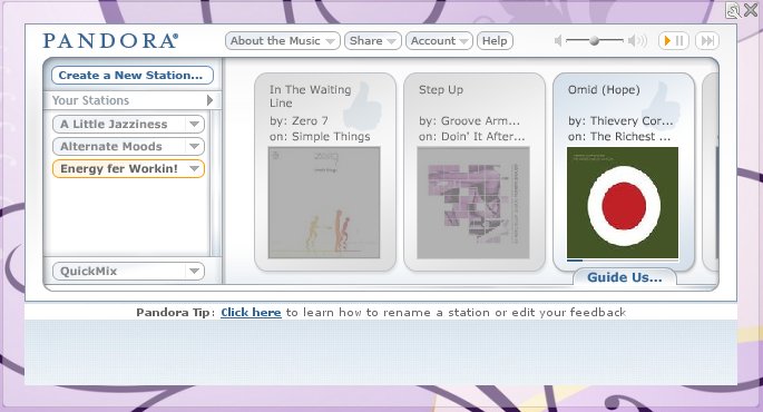


Pandora: crystal clear value, no games
Pandora: the exact opposite of cubeduel. From the first minute of using Pandora, its value proposition is obvious, and you're hooked. No game mechanics whatsoever are necessary to keep users engaged.


    StackExchange: clear value, good game mechanics
    StackExchange: the StackExchange sites are a great example of a strong core value multiplied by effective game mechanics. Most users end up on one of their community sites (StackOverflow is the most popular) by googling a question. The utility of the site becomes obvious immediately: quality answers written and vetted by a community of experts. If your particular question isn't there, you can sign up and ask. At this point, the first game mechanic is revealed: the reputation score. This score starts at zero and as it increases, various "privileges" become available: for example, you can't add comments, create new tags, downvote answers, or offer bounties until your score reaches certain thresholds. To get your score higher, other users need to upvote your questions and answers, which encourages you to actively participate in the site. When you do this, the next game mechanic becomes apparent: your profile. Your questions, answers, reputation score, and tags from any discussions you participated in are all publicly visible. Again, the value is obvious: professional reputation. If you do a good job of participating on the site, you look better in front of employers and colleagues. Strong value * effective game mechanics = 24 million unique visitors per month (and growing).

    Stop playing games. Start building awesome products.

    Kniffel: game mechanics != fun
    Game mechanics can be a powerful tool, but like everything else in your toolbox, it's all about knowing when and how to use them. If you're working on some new product, start with the basics and make sure that you have the value proposition nailed down. Only when you have something sufficiently compelling by itself should you start thinking about adding any sort of game mechanics.

    A physical analogy for the creative thought process

    As a software engineer, I tend to be very methodical in my thinking. I approach every problem by breaking it down into discrete pieces, analyzing each one in a logical fashion, and following a series of coherent steps to a solution. It's easy for me to picture my conscious, problem-solving mind as a some sort of geared device, a Rube Goldberg machine, or even a computer applying an algorithm.

    But what about creative thinking? What about moments of inspiration? You’re sitting on the can and WHAM, out of nowhere, an idea hits you. There was no conscious thought process, no gears turning, nothing visible happening. It's as if creativity happens behind a curtain and when the process completes, your unconscious hands you an answer. What physical analogy could explain what happens behind this "curtain"?


    When it comes to creativity, the analogy of gears and machines seems largely unsatisfying, failing to provide an explanation for both (a) the random and unpredictable aspects of creative thinking, such as how answers and ideas can just appear at any time or place and (b) the more deterministic trends, such as some people consistently being more creative than others and some situations fostering more creativity than others. Rather appropriately, a possible solution to this problem came to me in a moment of inspiration: seemingly out of nowhere, I started to think about coin flips, index cards and an interesting analogy came to mind.

    Creative thinking as a deck of index cards

    Imagine that you have a deck of index cards and that each card has a word or phrase on it. These cards represent the ideas and thoughts that are floating in your head. The creative thought process can then be seen as:
    1. Shuffle the index cards.
    2. Drop them on the floor. 
    3. Scan over the cards and see what sentences have formed from the random arrangement of words.
     Most of the time, the random permutations of words will be meaningless. You just have to pick up the cards and return to step 1. However, every now and then, a meaningful sentence or thought will emerge. Sometimes this will be a full solution to a problem - the "aha!" moment; other times, this will be a mere stepping stone from which you gather enough info to add or remove index cards from your deck before returning to step 1.

    What I like about this analogy
    1. It cleanly explains the unpredictability of the creative thought process without resorting to any magical or divine reasoning. Sometimes the cards fall the way you want, sometimes they don't.
    2. The particular choice of cards in your deck and the way you adjust them with each iteration is a great model for why your creativity may "click" for some problems and not for others. For example, consider "linguistic equations" or "DITLOIDS" style puzzles (warning: these links are highly addictive). Most people are able to solve a few very quickly, but get stuck on the rest for a long time. This could be seen as the natural outcome of which index cards you pull into your deck as you read each problem. For example, when you see the number 26, there are very few concepts - and consequently index cards - that you would associate with that number. The size of the deck is small and it only takes a few trials before a meaningful answer emerges. On the other hand, a number like 3 has MANY possibilities, resulting in many more cards in the deck and consequently many more iterations before you stumble upon the proper permutation. 
    3. We can also explain why, even when faced with the same types of problems, you creativity may fluctuate by considering the possibility that not all the possible "index cards" of your mind are equally accessible. Depending on what you've been doing and thinking about, some words/phrases will be top of mind and readily pulled into your deck; other cards will represent concepts you haven't considered in a long time, stashed in the deep recesses of your memory, and will rarely get pulled into a deck.
    4. I've always find that increased constraints lead to increased creativity. If I'm trying to solve too big or vague of a problem, I actually find it harder to come up with ideas than when faced with a smaller and more clearly defined problem. Again, the card analogy works here: broad and vague problems would be pulling in cards from all over your mind. These would represent totally unrelated thoughts and ideas and result in permutations that are completely meaningless. On the other hand, more constrained problems would result in pulling in cards that are closely related and consequently, much more likely to form coherent thoughts when they land next to each other.
    5. Finally, the index card system has several tuning points that could account for the creativity differences between people. This could result from varying values in the total number of cards available, the number of iterations per unit time the person can do, the ability to scan cards after each iteration and recognize that a permutation has meaning or value, the skill of picking which cards to put into the deck initially and the ability to adjust the cards in the deck after each iteration.
    Vegas?

    If this analogy were true, it would suggest that the brain uses a Las Vegas Algorithm for creative thinking. This may also help explain why brainstorming sessions can be an effective way to get creativity going: they are a conscious way to pull in ideas and try all sorts of permutations until, hopefully, a useful one emerges. Einstein may have refused the idea that God would play dice, but perhaps, behind the curtain of our unconscious, we are just playing cards.

    I finally understand open source software

    What does Google stand to gain from having so many open source projects? What about Twitter or Facebook? Why would companies freely give away software that cost them time, money and may help their competitors? Why is Github growing at an absurd rate, with over 2 million repositories? Why are developers world-wide giving their time and work away for free?

    I've used a TON of open source software (e.g. see the "what technologies were used section" of the Resume Builder) and am a very strong believer in using open libraries and standards whenever possible. However, until just recently, the full motivation behind open source software - why so many individuals and companies contribute - never really clicked in my head. As soon as it did, I created my first open source Github project.

    I realized that open source isn't about doing the world a favor, sharing, or acting charitable. It's not about freedom, choice, human rights, standardization, or any of that. Sure, all of these play a role, but none of them are enough to explain how the open source movement got to where it is today. What I think really drives open source are three major benefits to the project creator: free labor, cleaner code and portfolios.

    Free labor

    The benefits of open source software to an end-user are obvious: you get to use amazing libraries, operating systems, standards, and tools, for free. You can take advantage of projects that have been built and tested by hundreds or thousands of developers, learn from the source code, customize it for your needs and build bigger, better things in less time. You get to stand on the shoulders of giants.

    What wasn't as obvious to me was just how much the project owner benefited from me using it. Every time I ran the code, found a bug, or tried out a benchmark, I was performing QA and performance testing - for free. Every time I asked questions online or posted a tutorial, I was writing documentation - for free. Every time I used the project in my codebase and told others about it, I was advertising the project - for free. If I created a patch, or added a new feature, or made suggestions for improvements, I was helping to design and develop the project - all for free.

    In other words, the open source community using your projects is, quite literary, a totally free and incredibly effective workforce. Google open sourcing snappy may help everyone in the community do fast compression, but if they can get enough people interested in the project, it helps Google even more when that community finds bugs, fixes them, builds new features and contributes it all back to snappy. The cost of hiring a few hundred developers and QA to work on a project like snappy would be prohibitively high, even for a big company; for a lone developer, totally impossible. But open source it, and you get a huge pool of labor for free.

    Cleaner code

    It turns out that knowing that other people will scrutinize your code, tear apart your design, and use it in ways that you didn't expect is a superb motivation to keep things clean. The very act of taking some code and making it a "project" will encourage you to make things more modular and reusable, write documentation, use source control, track bugs, all the good stuff. It's just human nature to clean the apartment more for guests than yourself; as such, open source projects tend to be cleaner than proprietary ones.

    Portfolios

    Open source projects are the best portfolio a software developer or company can have. It's hard to learn much from just seeing the end product (if it's even publicly visible); interviews are sadly not too revealing either (a topic for another blog post); resumes and "about me" pages are all but useless. But when I can see every line of code, the design decisions, and the technologies involved, I can get a very good idea of the type of person or company I'm dealing with. It's the ultimate branding play: show, don't tell.
    When it comes to hiring, I'll take a Github commit log over a resume any day. - John Resig
    I'm a believer

    I've been an open source end user for a long time. It's about time I actively start contributing. Not because it's good for the world or because I want to better humanity - it is, and I do, but that hasn't been enough motivation before. No, I'm going to contribute to open source because I finally see how it'll directly benefit me. No reason I can't be selfish and save the world at the same time.

    This is where I work

    LinkedIn just had a "pimp your row" competition where each row of cubes got money to spend on decorations. The results were astounding. As I walked around, I had to remind myself this was an office. This is where I work.


    The Platform Team

    Core team

    The LinkedIn Zoo
    Gotta love the aquarium


    Funneling red bull?


    Corporate IT totally blew me away

    They turned their office space into a night club

    With beer on tap

    Awesome shirts


    Crazy lights


    The photos do it no justice, so definitely check out this video


    Our university recruiting team, making college students feel right at home


    Content and community


    Enterprise hiring solutions


    Hooka bar


    (My apologies for the quality of the photos: I only had my iPhone on me).