Showing posts with label Review. Show all posts

Siri: a glimpse of the future

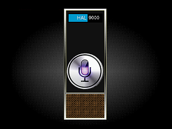
Open the pod bay doors, HAL.
Last week, I picked up an iPhone 4s and got a chance to try out its premiere feature, Siri. Siri is a digital assistant that lets you talk to your phone to get things done. You can turn the phone on, bring it up to your ear, and ask Siri for driving directions, to add reminders, find restaurants, play music, schedule meetings and more.

When I first heard about this, like many others, I wasn't impressed. Why would I want to talk to a phone? The UI on an iPhone is efficient and, as a techie, I'm pretty good at using it. Even though we've seen it predicted in all sorts of Sci-Fi movies, from Scotty in Star Trek to Dr. Bowman in 2001: A Space Odyssey, I was still not sure why talking would be preferable over other interfaces.

After using Siri for a week, I get it. Siri is a glimpse of the future.

In this post, I'll tell you why that's a very good thing.

It's not voice recognition

First, let's get something out of the way: Siri is not just voice recognition. Voice recognition by itself is nothing new and has been available for a while, even on phones. The important thing to understand is that voice recognition is merely the first step of what Siri does. It's what happens after your voice has been transcribed that's new and exciting.

Siri does a remarkably good job of natural language processing. In other words, it actually tries to understand human speech.

Before Siri, almost all voice recognition systems only worked if you used a very specific set of keywords and phrases - incantations, really. With Siri, you can speak more or less naturally and it (she?) does a remarkable job of understanding you. You don't need to read a manual or cheat sheet to use Siri: just start talking and you'd be amazed at how it seems to just work. It's certainly Clarke's third law at play, but at times, Siri seems truly magical.

Context

Not only does Siri understand normal human speech, it's also aware of the context around the conversation. For example, Siri is aware of both your location and where you live, so you can say:
"Remind me to water the plants when I get home"
As you pull into your driveway, the reminder will go off. Or, you can try:
"Do I need an umbrella this weekend?"
And Siri will check the forecast in your area, see that it's 70 and sunny, and say "no". Siri also remembers the previous things you've said, so you can have a whole conversation with your phone:
"What pizza places are around here?"
"I found a number of pizza restaurants fairly close to you." (a list comes up with Yelp reviews)
"What about burgers?"
"I found 20 burger restaurants fairly close to you." (another list from Yelp)
"What's the best one?"
"I found 20 burger restaurants fairly close to you. I've sorted them by rating."
Natural language processing + context + apps = some amazing possibilities that go far beyond the "voice recognition" you've seen before.

Efficiency

At first, I thought Siri would only be useful when my hands are busy, such as while driving and never expected to talk to my phone otherwise. As it turns out, talking to Siri can be a huge time saver in all situations. For example, imagine I want to set an alarm that will go off at 9am every weekday. Here are my two options:

Option 1: touchscreen UI
  1. Push the power button
  2. Slide to unlock
  3. Swipe through app screens to the clock app and tap to open it
  4. Tap the alarms tab
  5. Click the plus (+) to create a new alarm
  6. Use the spinners to set the time to 9am
  7. Tap the repeat menu
  8. Tap each of the weekdays individually 
  9. Tap save
  10. Done.
Option 2: Siri
  1. Push the power button
  2. Hold the phone up to my ear and say "wake me up at 9am every weekday"
  3. Done.
We're talking an order of magnitude faster. Similar time savings can be observed when getting directions ("how do I get home?"), scheduling meetings ("setup a meeting with Jon for 9am tomorrow about mobile strategy") and many other tasks. The ability to skip dozens of menus and huge amounts of text entry is a huge boost in efficiency.

And here's the kicker: the iPhone touchscreen UI is built incredibly well. It's arguably one of the most intuitive and efficient UI's available. Despite that, it's still orders of magnitude slower than Siri.

Accessibility

Speed and efficiency are great, but accessibility is why Siri is truly a glimpse of the future.  Although the iPhone touchscreen UI is intuitive and beautiful, it's still something that must be explored, experimented with, and learned. I'm a "power user", so I find it easy; the average person, even with a best-of-class interface, will find it harder.

The beauty of Siri is that it makes all of the functionality of a high tech smartphone available to everyone. Even the least tech savvy person knows how to talk, give commands, and ask questions. As Siri progresses, the bar for using the state-of-the-art will get lower and lower.

And after all, wasn't that always Steve Jobs' goal? Wasn't he always striving towards technology that was accessible to anyone, with no training and no confusion? Siri is a small step in that direction: pick up your phone and, in plain English, tell it what you want.

Personality

Finally, Siri has a personality. She can even be a bit cheeky.


There's an entire site dedicated to Siri's clever responses. But these are more than just easter eggs. They bring Siri - and your iPhone - to life. The iPhone has always done spectacularly well in terms of customer satisfaction; giving the phone a personality will make people love it. Siri will become assistant, friend, and even a part of you - we are cyborgs, after all. I suspect that after Siri, you'll never be able to go back to a phone without it.

Just the beginning

Now, let's not get ahead of ourselves. Siri is just the very first step. Actually, that's not entirely accurate: Siri is yet another step in a long continuum of making computers ever more accessible. From punch cards, to the command line, to the mouse & keyboard, to touch screens, and now, natural language processing. There is still a great deal of work to do, but give Siri a try now to see where things are headed.

In the near future, I expect Siri to be integrated with countless more apps. For example, I'd love to see Shazaam ("what song is this?"), New York Times ("what's happening in the world?"), shopping apps ("is this a good deal?"), and social networking apps ("who is this guy?"). I wouldn't be surprised to see some element of "learning" added as well, allowing Siri to become more personalized by using more info about you and your contacts (e.g. via Facebook, Twitter and LinkedIn integration), getting better with accents and mannerisms of speaking, remembering previous conversations you've had and... who knows what else.


Eten Glofiish M800 Review

For those that don't know, the Eten Glofiish m800 is a phone. And a PDA. With GPS. And keyboard. And it runs Windows. And...

OK, so it's more than a phone. It's a windows mobile smartphone that is as feature packed as it gets these days. The full specs:

  • Quad band world phone (850/900/1800/1900 MHz)
  • Tri-band data (GPRS/EDGE/UMTS/HSDPA 1.8 Mbit/s/HSDPA 3.6 Mbit/s)
  • 480x640 (vga) resolution
  • Full qwerty keyboard
  • Touch screen
  • Windows Mobile Professional 6.0
  • Wifi
  • GPS
  • Bluetooth
  • microSD slot
  • 2mp camera
  • Kitchen sink
  • Around $600 (unlocked)
In short, it has just about everything. The design isn't as pretty as an iPhone, but it's not terrible either. The size and weight are reasonable for a phone that does this much. It even comes with a carrying case and a headset. Overall, it looks wonderful - on paper.

So why did I end up sending this phone back?

Well, the phone falls just short of expectations in just about everything. No one flaw would have been enough to reject it, but the numerous small issues added up really quickly to a very frustrating experience.

The Screen


The VGA resolution is fantastic. It offers significantly more screen real estate than the average smart phone (which is qvga) and provides a great experience when web browsing, navigating via gps, writing notes, etc. Everything is crisp and the colors are solid. That is of course, until you step outside. In the sun, the screen is VERY difficult to read. As if you don't already look like a dork for carrying around such a gizmo in public, you have to bring this thing to within an inch of your face just to read the time.

The screen does a good job of interpreting the stylus and is even effective when you use your fingers. I was impressed with the recognition of light taps, holding down the stylus (for right click) and had a far better experience than I did with an expensive tablet PC I had used years ago. My only gripe would be the handwriting recognition - there are several different modes, each of which suck horribly. Their primary use is to entertain yourself by seeing them misinterpret your writing in unexpected and hilarious ways. However, it's not much of an issue given the presence of a physical keyboard and even an on-screen touch sensitive keyboard you can use that works very well with the stylus.

The Buttons


The keys on the keyboard aren't raised or particularly distinct feeling, but somehow, typing is still fairly easy and you don't make too many mistakes. It's a vast improvement over typing on any of the other phones I've tried, including those with a standard phone keypad (3 letters per button), blackberry style keypad (2 letters per button), and it's certainly better than touch screen "keyboards".

However, the buttons on the front of the phone, just below the screen, are abysmal. Instead of normal push buttons, as used on the rest of the phone, these are special touch sensitive buttons - they don't move, but just glow when they have detected a touch. These buttons are so ingeniously designed they they can interpret your desires: every time you want to push them, they cleverly pretend to be asleep and do nothing. And every time you brush them accidentally as you type, slide the phone open, put the phone in the carrying case, or admire some other phone, they delightfully glow and immediately open up whatever process is going to be most CPU intensive and inconvenient to run at that moment. These things are a travesty and largely useless anyway, so you end up using a key combo to lock them and hope to never use them again.

They keyboard also gave me an odd issue where the light indicating caps lock was activated would remain in the on position, even though caps lock wasn't actually on. When I did turn caps lock on, the light would shut off. This could have been more clever, counterintuitive Eten design... But more likely, just a silly bug.

Performance

The m800 has a 500Mhz processor, which is a pretty good work horse. However, as is clearly a trend with this phone, each good feature is handicapped in some way. In this case, it's by the paltry 64MB of RAM. Oh, and the total lack of any sort of video acceleration. The result is a slow experience that only gets slower.

Everything on screen is just not quite as zippy as you'd want it to be. Menus take a few seconds to open, switching to landscape mode takes anywhere from 2 to 10 seconds (depending on the application running), web pages are slow to render, and programs take a while to open and just as long to close. Scrolling and animations tend to be twitchy (probably due to the lack of graphics acceleration), there are no fancy effects on the phone (like the iPhone has) and nothing is pretty. Music files play just fine but every video I tried was twitchy and largely unwatchable.

And the more things you have open, the worse it gets. In fact, even when you think you've closed a program, it sometimes continues to run in the background, eating up RAM. See the Windows Mobile 6.0 section for more on this. Eventually, after you've opened and (thought you) closed enough programs, the RAM starts to run out and the system grinds to a halt. You can try to use the memory management software to kill all running programs, but for some reason, this rarely restores all memory and everything continues to crawl. Eventually, the only option is to completely reboot the phone.

This takes roughly 2-3 minutes, which is quite irritating. You don't have to do it often, but it's always at a bad time when you do. The good news is that during normal usage, you typically put the phone on standby, which shuts off the screen, saves lots of batteries and turns back on in a couple of seconds.

I can't help but to think that an extra 64MB of RAM would have significantly improved the speed of the phone and the entire user experience at relatively little cost. All the latest powerful smartphones (HTC TYTN II, I-Mate Ultimate 9502, etc) come with 128MB of RAM and it's a shame to handicap a phone in such a way.

Battery Life

I didn't expect battery life to be great for a device like this, and it definitely wasn't. From very moderate daily usage - for example, 10 minutes of phone calls, using the calendar for 10 minutes, connecting to wifi and checking my email and spending the rest of the day on standby - the phone would drop to ~50% battery life. That means you'd have to charge it every other day, at least. Things only got worse if you used the GPS, did any real web browsing, or used any other heavy-weight apps (e.g. google maps).

In short, I would typically leave the phone plugged in (via USB) to my computer every night so it could charge. The phone does come with a modular AC adapter which allows you to attach many types of plugs, which is great for traveling. Unfortunately, my phone only came with two plugs: a UK plug (which was useless to me) and a US plug that did not fit the adapter. It was a different color and definitely looked like it belong to a different phone. I don't know if this was the fault of E-ten or eXpansys (the store I ordered the phone from), but it made the AC adapter into a wired paperweight.

GPS

The GPS typically connected in under a minute, although occasionally I had to wait several minutes and once, it wouldn't connect at all. I used it with TomTom 6 and the results were fairly pleasant: the UI worked and looked good on the high res screen and the GPS seemed fairly accurate. It took a little while to set up TomTom the first time to recognize the built in GPS unit (the configuration is less than intuitive), but this has nothing to do with the phone itself. Calculating routes took ~10-20 seconds, which is not terrible, but not great. Including the time it takes to connect to the satellites, enter your destination info, calculate the route and start displaying the map, you can expect a ~2 minute overhead per trip. Not the end of the world, but again, just not quite as zippy and responsive as I wanted.

Windows Mobile 6.0

I had limited experience with Windows Mobile before using this phone and can say that the 6.0 version is less than impressive. For the most part, it's a crappy OS with an ugly UI that does a good job of supporting touch screens and is saved by the availability of lots of decent software.

There were two issues that drove me nuts and both were very un-windows-like. The first was the lack of a task bar, leaving you no obvious or easy way to see what programs are running or switch between them. Each program would typically take up the full screen and the only way to get back to a different one was to "run" it again from the start menu or programs folder. The second issue was that pushing the x button to close a program... didn't always close the program. Quite often, the program would disappear from view, but continue running in the background. Oddly enough, these are both issues present in OS X, but at least OS X offers some reasonable solutions, such as expose, apple + tab, and the dock (which is like an unintuitive task bar).

As I mentioned in the performance section, there are precious few system resources to work with as it is, so wasting them on programs you thought were closed is unacceptable. And with the lack of a task bar, you just don't know it's happening. Moreover, it's unclear just how you'd close these programs completely. The only solution I found was to use the memory manager, which is like a retarded half brother of Windows' task manager (which is the ugly cousin of OS X's Activity Monitor). This program would at least show you what is actively running and give you the option to close each program. Unfortunately, this menu option never worked for me. Instead, I'd have to use the "kill all" option, which would shut down every running program, which is not always desirable.

Windows Mobile also suffers from a crappy web browser (Internet Explorer Mobile), crappy media player (Windows Media Player) and the total lack of support for Flash. The latter means no youtube (or any other sites that depend on Flash), which when added to the twitchy video performance of Windows Media Player, is quite frustrating. Worse yet, if you visit youtube on your mobile phone, you are taken to a page that is designed for mobile phones and really looks like it's going to work. But don't hold your breath, it doesn't. Not only is there no support for Flash, but there is also no support for the RTSP protocol, which is what the mobile youtube site tries to use.

The big saving grace for Windows Mobile is the large amount of quality software available for it. It's easy to make the software (in .Net, for example) and many people have produced some good products. Not all are free, but if you're serious about using this kind of phone, they may be worth the money. Some of the key pieces of software I found:

  • Magic button: adds a proper close button to Windows Mobile that actually closes (most) programs. It also adds a taskbar! This is an absolute must have.
  • Opera mobile: a much better web browsing experience than IE.
  • Fring: multi-protocol chat.
  • Resco Explorer: much nicer file explorer than the default one in Windows Mobile.
  • tcpmp: Windows Media Player replacement.
  • Google Maps: self explanatory and highly useful.
I also like the ability to use remote desktop on Windows Mobile phones so that you can actually control your home computer from your mobile device. It's easy to find and install the software and most of it runs w/o too many issues. These can make Windows Mobile, for the most part, worth it.

Accessories

The headset that came with the phone got the job done, although there was an audible hiss coming from the headphone jack. Speaking of which, the headphone jack was 2.5mm, which is not the standard size. Not a big deal, but it would be nice to be able to use my normal headphones (such as my ipod headphones) without a converter.

The carrying case is not pretty, but well designed to securely hold and protect the phone. It doesn't get in the way when you wear it, which is nice. Unfortunately, it ripped after just several days of normal usage. Sigh.

Data plan

I use AT&T as my carrier and do not have a data plan - I just don't think it's worth paying $40/month to be able to check my email from the bathroom. Moreover, the phone has Wifi (more on that later) so I can still get Internet at hot spots, such as my house, at work, Starbucks, etc. Unfortunately, a couple times while using the phone, I did not notice that the Wifi was off (to save batteries) and I started to browse the web.

As it turns out, neither Windows Mobile, nor E-ten, nor AT&T provide any warning that you are suddenly using a data plan (or lack thereof) and as a result, you can get charged. A lot. I got lucky and "only" had to pay $5, but as there is no clear indication of which network connection you're using (wifi, data plan, bluetooth bridge), it would be very easy to run up quite the fee.

Wifi

The wifi is really useful to get free Internet access at hotspots and when it works, works reasonably well. I didn't benchmark it, but I'd say it was fast enough that most Internet performance was limited by the phone's CPU/RAM and not the bandwidth.

Unfortunately, the wifi really likes to lose wireless passwords. It seems like every time I would switch networks, I would have to reenter that network's password, even if I checked the box asking the phone to save the password. This got to be real annoying, as I would connect alternately to the wifi at home and the wifi at work and had to spend a lot of time entering the damn passwords.

Worse still, the wifi would sometimes refuse to connect all together. I would select a network, enter the password and see the status go to "connecting". Suddenly, the screen would refresh, and the network I was trying to connect to would be gone. I'd have to exit the wifi manager and come back a few seconds later to see it again. I'd click the network again, enter the password again, and quite often, see it vanish once more. This could go on for several iterations before an actual connection was established... or the phone was sailing through the air.

Call Quality

Call quality wasn't great, but it wasn't terrible. Occasionally, I'd be told that I sounded like I was very far away, but in general, it was reasonable. Oh, and the speakerphone worked pretty well too.

The only downside was the random day when the phone refused to allow any calls to connect. For about four hours one day, I could not place or receive calls properly. If someone called me, the phone would ring, but when I answered it, I would hear nothing on the other end. If I tried to place a call, I'd hear at most one ring, and then two quick beeps, followed by silence. The phone showed 3-4 bars of connectivity and did this at home and at work. My other phones (on the same AT&T network) never exhibited such behavior. Other people with AT&T in the same area also had no issues. And after the 4 hours, the phone worked just fine again.

I still don't know what caused it, and it only happened once, but it's worth mentioning.

Other

You can connect the phone to your computer using Microsoft ActiveSync, which worked reasonably well to let you sync your calendar, email, install software and transfer files. Unfortunately, every now and then, ActiveSync would fail to connect to the phone and the only solution was to reboot.

The m800 has 256MB of on board memory, which is plenty to install lots of good apps, and the microSD slot lets you add plenty of additional memory for music, pictures, etc. I used a 4gb microSD (HC) card in the phone without any issues.

The phone also has a camera and an FM radio. The camera is crappy, pretty much standard for mobile phone cameras. It's good enough for quick snapshots, or to take pictures of people's faces to add to their contact info, but that's about it. The FM radio works very well and is a nice, although not terribly useful, addition.

Conclusion

I hope you noticed a trend through out this whole review. Every good thing I had to say about the phone would end with an "unfortunately..." or "but..." or "%&$!D!!". No one of the issues above was a game breaker. But the plethora of problems added up damn quick and just became too much.

The E-Ten m800 is not a bad phone and it certainly has all the bells and whistles, but for $600 I expected more.

Why I probably won't be buying a mac any time soon...

I'll just jump right into it. Since the last blog entry about the Mac, here are:

The new things I like:

  • It boots up quickly
  • I really like the preview feature and desperately miss it on other OS's
The new things I DON'T like:

  • The pinwheel of death. For a computer with a dual core CPU and 3gb of RAM (yes, 3gb, not 2), the pinwheel appears an obscene number of times. When opening more than one webpage, when compiling, when opening NeoOffice, completely at random, when something crashes, and so on. Why does OS X suck so much at distributing processing time over the cores? Why do both cores get pegged down completely so damn often? The hourglass cursor is FAR less prevelant on my Windows computer at home which has similar specs (dual core CPU and 2gb of RAM).
  • Firefox runs like crap. It is noticeably slower on OS X. Pages take longer to load, it eats up a lot of CPU while rendering them, and yes, you get to see a whole lot more of that damn pinwheel. It's especially bad on certain pages (such as Facebook), possibly indicating some AJAX issue. It also eats up a lot of RAM, although that happens with Firefox on any OS. Hopefully version 3.0 will improve this.
  • Mail crashes more often than it should, and when it does, it has a way of taking the whole OS with it. I can rarely (if ever) recover from Mail locking up - force quit can't quite handle it - and usually need to reboot. Moreover, I've become slightly disillusioned with the built in search. It will quite often refuse to find emails that contain text exactly matching your search terms. Finally, its conversation view is inferior to gmail. Having said all that, it is still incomparably better than Outlook.
  • I got a Blackberry Pearl recently (I'll post more about my phone adventures later) and to put it simply, trying to sync a Blackberry with a Mac is damn near impossible. The Mac will find the phone and connect to it via bluetooth... I think you can even transfer files... But the sync will fail every time. Just google for it and you'll find legions of users frustrated by this. Even over a USB cable, the sync is extremely buggy: the sync program seems to hang, the status bar never reaching 100%, and you only get a partial sync. The events on the phone end up on the computer, but not vice-versa. I can't say this is the fault of Apple, but given the popularity of Blackberry devices, this is pretty disappointing.
  • The computer has some graphics driver issues that, according to an article one of our IT guys showed, Apple will not address. The symptoms vary a bit, but on my computer, I will get a complete lock up every now and then. The whole system will freeze and not respond to any kind of input. I have to hold down the power button and reboot. I've tried some manual fixes posted online (which involve booting off an OS X install disc and manually replacing graphic driver files), but they led to some graphics corruption, so I had to revert live with it. The crashes are rare, but very unpleasant. Again, I'm not sure it's Apple's fault - maybe nVidia or ATI are to blame - but Apple's big sell is that they control the hardware, and such problems are quite disappointing.
  • A less severe symptom of the driver issues is that the computer has issues with dual monitor support when booting (or, say, rebooting after a total lockup). If I leave my external monitor plugged in when I turn the computer on, the computer will seem to switch into an extended desktop mode (the desktop on the laptop screen will change appropriately), but the external monitor stays completely black. The ONLY solution I've found is to shut down the computer, unplug the monitor, boot back up and then plug the monitor back in once the OS is running.
  • The keyboard shortcuts are driving me nuts. I know I wrote about this in the previous post, but even after several months of use, they still feel wrong. For example, in many pop-up dialogs (such as an ok/cancel), you can't always switch between the buttons using the keyboard - I've tried arrow keys, tab, apple + arrow keys and several other combos, and none of them do anything. In some programs you can push the apple key plus the first letter of the option (ie apple + D for Don't save in TextWrangler) but this is not consistently available. The keyboard shortcuts themselves for various system operations are not always listed - for example, why are there no keyboard shortcuts next to sleep or logout in the Apple menu? Finally, the inconsistency of keyboard shortcuts can be maddening. In some programs, apple + B makes text bold. In others, it's ctrl + B. In some, switching tabs is done with apple + arrows (in which case, I have no idea how you get to the beginning/end of a line of text), in others, it's ctrl + tab (and apple + arrows instead have a totally different behavior, such as back & forward in a browser). The list goes on and on.
  • Finder sucks. I tried to like it, and I do appreciate the search feature, but it's just a dumb way to handle file management. Not being able to see the whole file structure (ie, anything above your home folder) is maddening. I understand the whole security/permissions setup of Unix can keep the system safer, but on a 1 (power) user system, it would be real nice to be able to just have full access to your own goddamn computer.
  • I hate the blinking, bouncing notifications in the dock. I understand that you want to install update #457 for the OS or give me some mundane, completely unimportant message, but every time a goddamn icon starts hopping incessantly at the periphery of my vision, I just want to put my fist through the screen.
  • I've never found expose useful. It looks gorgeous and is nice in theory, but it just doesn't seem efficient. I'm used to good keyboard shortcuts, so a more powerful alt+tab - as available on Vista - is significantly more useful.
Is Windows that much better?

No, not really. Windows has its own share of flaws and frustrations and as I said in the first post, neither OS is head & shoulders above the other. The point of this post was to vent a bit and challenge the conception that the Mac is some holy mecca of operating system salvation. Same shit, different smell.

However, for my purposes, Windows does get the job done just a little smoother and cheaper (esp. the hardware). If I can ween myself from gaming (or let the lack of quality games do the job for me), I may even switch to Ubuntu some day. Free definitely has it's advantages.

Working on a Mac

Introduction

At my new job (at TripAdvisor), we were given the following choice for the work computer:
  • Linux workstation
  • Macbook Pro

The vast majority of my computing life has been spent on Windows, so either choice would present a significant change. I picked the Macbook Pro because I like the portability of a laptop: it lets me easily work from home, I can bring it with me to a meeting and also use it for non-work purposes. As I will be spending a lot of time on this thing, I will be posting my impressions of the transition here.

The Hardware

  • MacBook Pro
  • Intel Core 2 Duo 2.2 Ghz (dual core)
  • 2GB ddr2 800 RAM
  • 15" widescreen display, 1440*900
  • nVidia Geforce 8600GM GT
  • 120GB HD
  • OSX 10.5 Leopard

Since Macs and PCs use essentially the same hardware nowadays, there is nothing unusual here. It's a very solid system with enough horsepower to let me run Eclipse, a web server and half a dozen apps at the same time reasonably well. The only standout feature is the built in webcam, which has been largely useless to me, but is a neat toy with some fun software.

The only noticeable difference with Apple's hardware is the meticulous effort Apple takes in the look and feel. The whole notebook has a nice steel look with lots of rounded edges. The Apple logo on the back of the LCD lights up when you are using it and the tiny LED on the front of the laptop will slowly pulsate when you put it to sleep. Even the wires are made out of a nice white plastic and have simple very Apple-esque designs.

Overall, it's an attractive package, which is far more than I can say for my last laptop, the IBM ThinkPad T43. Apple takes real pride in its design and it's not shy about telling you that: when you open the box the laptop comes in, the first thing you see is a large piece of black cardboard, in the middle of which is proudly proclaimed, in elegant white text:

"Designed by Apple in California"


...of course, it doesn't say built by Chinese and Mexicans in sweat shops :)


The Software - The Good

There is one thing OS X has going for it that I desperately want in windows: the search box in the top right corner of almost every application window. You can see it in Finder, Spotlight, the Mail program, System Preferences, iCal, iTunes and tons of other programs. In each case, the program indexes its contents (the song names in iTunes, your email in Mail, etc) and as you type something into the search box, it instantly filters the results to just items that contain the search terms. It makes launching a program, finding files, finding emails, etc extremely quick and efficient. It's available to some extent on Windows with third party apps such as Launchy and Google Desktop, but system wide integration in OS X is incredibly nice.

OS X comes preloaded with a ton of software. Given that Microsoft was sued for including Internet Explorer with Windows, I don't know how Apple gets away with it, but OS X users should be happy. Some of the software I really like: iTunes is a very solid media manager. The Mail program and iCal blow away Outlook and its calendar, and you only get Outlook if you shell out extra money on MS Office. iMovie (from watching others use it) seems very impressive, especially when stacked up against Windows Movie faker.

iPhoto, iChat, and Safari I'm less thrilled with. They get the job done, but aren't anything out of the norm. Widgets (which are available for XP and Vista) I don't like on any OS. The Preview app, which is unique only for its "cover flow" ability is very pretty, but honestly, fairly useless. Thumbnail view, while not as pretty, is a much more efficient way to find something visually. Finally, spaces is a neat (although very old) idea, and the execution is decent, but as I have multiple monitors at work, I have no use for it. I also haven't tried GarageBand or Time Machine yet, although I hear good things.

OS X can also be fairly intelligent and well integrated. It does a lot for you (sometimes too much) that can be quiet useful. For example, as soon as you plug a monitor into the DVI port, it turns it on and extends your desktop onto it. In Windows, I'd have to dig through several annoying menus (which differ widely depending on your video card) to enable the second monitor. If you highlight a date or time in the Mail program it gives you the option to add an event for that time to iCal. If you have an icon for your user in OS X, Adium (a nice multi protocol chat client) will automatically use it as your buddy icon. Network computers are effortlessly visible in Finder which, as odd as it sounds, can sometimes make it easier to connect to even Windows networks on a Mac.

The Software - The Bad

Given the specs, OS X wasn't as responsive as I'd expect. It's by no means slow, but when launching apps and multitasking, there's a small amount of lag. I would guess that, like Windows Vista, all the extra graphical effects cause a bit of a slowdown.

Some small keyboard issues really irritate me on OS X. I understand the Apple button replacing the Windows button, but the changes are far deeper than that and oddly inconsistent. For example, if you push the Alt button in Windows, it highlights a menu at the top of the application. Alt + F often highlights the File menu. You can then use your arrow keys to browse the menu. OS X, as far as I can tell, doesn't have this. You either need to know the keyboard shortcut ahead of time or use the mouse.

The home and end buttons go to the beginning and end of a page, which is unlike every other OS on the planet, where they go to the beginning and end of a line. To emulate the proper behavior of home and end in OS X, you have to use apple button + arrow keys. This is an awkward combo to push and in Firefox, this actually will activate the back and forward buttons of the browser, which is a serious issue! Moreover, when using Firefox, instead of CTRL + T to open a new tab, you use Apple + T. But to switch between tabs, it's CTRL + Tab, same as in Windows. Obviously, some of this frustration is just the pain of switching between OS's, but a lot of it is inconsistent and illogical and could have been avoided.

Another odd thing is that when you close a program by clicking the red circle in the top left corner (the x)... it doesn't actually close. The window disappears and makes you think the program is closed, but secretly, the program keeps running. Your only clues are that the program still shows up when you Apple + Tab between programs. To actually close it, you have to use the menu or push Apple + Q. This seems like a very non user-friendly design, which is odd coming from Apple.

Browsing for files in Finder - largely because of the way user accounts are handled in Unix - is a bit unintuitive as well. It's often hard to see the proper file hiearchy, it's even more difficult to see files above your user's file hiearchy (this is somewhat by design) and the shortcuts in the left pane ("Macintosh HD", "Desktop", "Applications") only add to the confusion as you have no idea where in this hiearchy they fit. This is painful to someone coming from Windows, where I'm used to seeing every file and folder on the entire system. It is somewhat mitigated due to the wonderful aforementioned search feature but the file layout really should be cleaner.

Conclusion

Despite everything I say above, to be perfectly honest, during day-to-day usage, there is not much difference between OS X 10.5 and Windows XP. In the end, I'm still browsing the web with Firefox, coding in Eclipse, browsing files and folders, typing commands at a prompt and so on. Despite all the marketing hype, these two OS's are not polar opposites. They both do a few things very well and a few things very poorly. Everything in between - which is probably 98% of what you do with your computer anyway - is a matter of personal preference.

Personally, I would not buy a Mac for myself for a few of reasons:

* I build my own PC's, out of just the parts I want, which you can't really do with a Mac, although that's slowly starting to change as Macs use more and more standard hardware.
* Macs have far fewer games available.
* Actually, in general the amount of software available for the PC is greater than for the Mac. This is largely because the PC market is so much larger, but it's certainly worth considering.

Apple has come a long way from the original iMac and I'm relieved to say that OS X is a very solid OS. Given that the pre ~10.2 Mac OS's used to make me gag, this is pretty high praise. And who knows, maybe after using it for long enough at work, it'll start to grow on me. Or drive me nuts. We'll see.

Gears of War Review

Summary:

A terrific technical achievement that's well worth your time, but somehow falls short of greatness.

+ Superb graphics
+ Some unique weapons
+ Nice cover system...
- ... that becomes very repetitive
- Odd stylistic choices
- Impotent guns
- Extremely unstable
- Choppy performance

Introduction:

I found Gears of War a bit difficult to review. On the one hand, it gets so much right and truly brings something unique to the table. The game looks phenomenal, the cover system adds a new wrinkle on typical shooter gameplay and at times, the game feels like a sci-fi movie. On the other hand, the game experience can feel very repetitive and shallow. This game has gotten high praises from tons of game sites and is without a doubt worth a try, but I wouldn't put it anywhere near the list of greatest games of all time.

Let's break it down:

Graphics: 9.5/10
The GoW graphics engine (Unreal 3 engine, I believe) is excellent. The player models are extremely detailed, the lighting is top notch, there are high resolution textures everywhere, explosions look amazing and various special effects (HDR, blur) are used effectively. The game also gets massive credit for pulling off a flawless 3rd-person camera.

Artistic Design: 7.0/10
This is an area where GoW is much more uneven. The game shows some great attention to detail: the "shaky cam" when running, the brutal chainsaw animation, the even more brutal curb stomp, and the hammer of dawn are all unique and undoubtedly impressive. But I just can't stand some of the stylistic choices: most of the game settings are the same drab, boring color; all the (biped) characters in the game wear giant, ridiculous looking boots that must weigh 50lbs a piece; despite wearing armor on almost all of their body, in typical Unreal fashion, they don't wear a helmet; the tremendous overuse of HDR/soft light that makes everything look soft & washed out; the list goes on. While you can see the tremendous potential of the graphics engine, many of the stylistic choices really disappoint.

Sound: 8.0/10
The music in the game is reasonably well done, and the voice acting is pretty good. However, I found the sound effects to be more of a mixed bag. Most of the bad guys, for example, make the same stupid screaming/grunting noise every time they appear. Many of the guns don't have any real "boom" to them - they just sound like like a piece of paper stuck in a fan. Combined with the impotency of many of the guns (see the gamplay section below), you sometimes feel like you're firing spitballs.

Plot: 5.0/10
A completely generic, throw away plot. The focus of the game is definitely the action, not the story telling.

Level Design: 8/10
The majority of the game follows a very simple level design strategy: you walk into a room or outdoor area with scattered stone slabs/furniture/walls/etc. You hide behind these obstacles and pop out briefly to kill the enemies until the room is cleared. Then you move on. This cover system is pretty amusing initially but gets repetitive very quickly. Fortunately, GoW does toss in a reasonable number of unique set pieces that change up the pace. It's a good thing too, as the game is completely linear, so you definitely need the variety to break up the monotony of the cover system. You'll fight several types of enemies that are impervious to bullets, all of which require alternative strategies to defeat.

Gameplay: 6/10
At its core, the game is entirely focused on hiding behind obstacles, popping out to shoot and hiding again, repeat over and over until a room is clear. If you try running around in the open, you are often killed very quickly, so you have lots of incentive to stay well hidden. The cover system works well and definitely adds a unique flavor to the combat. However, it becomes boring in a surprisingly short time. The level design is already linear, so being forced into this repetitive mechanic can get monotonous real quick. One other gripe is that the game uses the same button to (1) take cover (2) sprint (3) perform acrobatic maneuvers (4) jump over obstacles. The result is that you often end up performing the wrong action at the wrong time, such as jumping for cover on the wrong side of a wall when you were actually trying to sprint around to the other side.

You have the typical shooter weapons at your disposal - machine gun, hand gun, shotgun, rocket launcher, sniper rifle - but all of them tend to be very underwhelming. There's really no way around it: most of the guns in the game are WEAK. On any difficulty setting above the easiest, you'll empty almost a clip of ammo to take down a typical grunt. It gets better if you go for headshots or take out their knees, but the fact that even the basic grunts take multiple hits to the head is still ridiculous. Some of the smaller bosses in the game that you'll encounter frequently can take a stupid number of headshots from the sniper rifle to their helmet-less heads, which is a mechanic few previous games would dare to ignore.

To pussify the guns even more, it's interesting to consider the weapons in GoW that do allow one hit kills. One of these is the chainsaw - yup, a good old chainsaw can cut through armor far better than a futuristic gun. Another lethal weapon is the crossbow, which fires explosive arrows. That's right, the arrows on the crossbow are even better than the grenade launcher. The game also features an active reload system, where if you time reloads just right, it makes your gun more powerful. Huh? Is the guy putting in the bullets backwards the rest of the time? Finally, to add insult to injury, hitting a baddie with the butt end of a rifle is often a 1 hit kill. You heard me correctly: the butt end of the rifle is more deadly than the bullets it fires. It's nothing short of ridiculous.

Fortunately, the game does offer some motivation to play it all the way through. On the Xbox 360, the ability to easily play through the whole game in coop mode adds a LOT to the experience. Some of the levels involve set pieces that are quite different from the standard cover & shoot mechanic and can be truly heart pumping. But in the end, the game feels oddly stale and unsatisfying.

Length: 8/10
As far as shooters go, especially those with such high production values, the single player is reasonably long, lasting around 12 hours.

Stability/Bugs: 4/10
While the game works flawlessly on the Xbox 360, it can be a nightmare to get it running for many PC users. Issues include (1) crash to desktop when the game launches, (2) crash to desktop after a couple minutes of play, (3) crash to desktop at specific points in the game and (4) massive amounts of stuttering. I personally struggled with #2 and #4. The former prevented me from playing the game until I found a workaround on the Gears of War Forums. The latter plagued my entire game experience, despite the fact that my hardware (see below) should have been able to handle the game fine. In fact, most of the game ran at a terrific framerate, but typically after a level loaded, and at random other points in the game, I would be watching a slideshow.

Performance: 4/10
As explained in the section above, the game stuttered like crazy on my system. In fact, the stuttering was identical at 1280x800 medium settings as it was at 1680x1050 high settings, so I ran with the latter. My computer:

AMD X2 3800+
2GB RAM
ATI x1900xtx
WinXP SP2

Overall: 7.5/10
I really wanted to like this game. It looks beautiful and is full of meticulous detail. However, the gameplay, some of the design decisions and the technical issues really diminish the game in my eyes. It's still worth checking out, but with a few tweaks here and there, it could've truly been great.

Additional Notes: I did not test (nor review) the multiplayer of this game.

Call of Duty 4: Modern Warfare Review

Summary:

Call of Duty 4 is one of the most exciting single player adventures in years. If only it was a bit longer...

+ Terrific graphics and presentation
+ Awesome sound
+ Amazing variety in gameplay
+ Incredibly tight pacing and scripting
+ Great set pieces
+ Tons of attention to detail
- Really, really short singleplayer

Introduction:

For the last year or so, I have found myself extremely underwhelmed by just about all the games I had tried. Even the "best of breed" - games that got rave reviews from virtually everyone - weren't doing it for me. S.T.A.L.K.E.R.: Shadow of Chernobyl, for example, got boring just 15 minutes in. Halo 3 - my first experience with the Halo series - was so absurdly unimpressive, I began to question the sanity of Xbox owners. BioShock, despite my recent interest in Ayn Rand novels, held my attention for no more than a few levels. During a particularly boring spell, I actually did play Quake 4 all the way through, but was left with a stale taste in my mouth. The game had brief glimmers of cool ideas & plot twists, but didn't develop any of them, and ended up feeling just like the original Quake, which I beat during another dry spell years ago. The list of disappointments goes on and on.

Only two explanations came to mind: either I had outgrown video games or I had ADD. I actually wasn't sure which would be worse. Call of Duty 4: Modern Warfare blew both of these excuses out of the water. The game is phenomenal and a testament to the fact that strong game design can impress even the most jaded gamer.

Let's break it down:

Graphics: 9.0/10
If you've got the horsepower to run it, this is one beautiful game. Great lighting effects, awesome particle effects (smoke, sparks, explosions), terrific use of blur, good player models, and high resolution textures really make this game worth looking at. The graphics engine is very well rounded, doing a terrific job with a wide variety of environments - day, night, middle eastern streets, central Europe in winter, ocean liner, office buildings, etc. Technologically speaking, some graphics engines out there might top CoD 4 in certain areas, but there's really nothing to complain about here.

Artistic Design: 10/10
The game is full of meticulous detail that really make it a pleasure to look at and play. It's really the little things that make it shine: the awesome tall grass & camouflage that actually allows you to hide; the subtle blur effect when looking down the site of a gun; the ability to shoot through certain materials (wood, sheet metal, etc); the realistic death animations; the way soldiers hold their guns as they enter a room; the heat coming off the barrel of a gun after firing; the lighting fast transitions from briefing to combat. And the list goes on and on. Quite simply, it's a pleasure to see the game in action.

Sound: 10/10
The sounds in this game are a huge part of what makes it so immersive. Every time a gun fight breaks out, it really sounds like a war zone. All around you, cars are exploding, pipes are bursting, glass is shattering, and RPGs are flying. Guns sound (and are) powerful, bad guys are constantly shouting in their native languages, and bullets will be wizzing by you non stop. The music is a perfect fit and the voice acting is top notch.

Plot: 7.5/10
The single-player game is story driven, but for the most part, it's a very generic tale of terrorism, war and nuclear weapons.

Level Design: 10/10
While the story itself is fairly forgettable, it does provide the setting for some incredibly memorable and exciting levels. The game is filled with "oh sh*t" moments that you'll be dying to show your friends. From the very first level (the one after the training), the game pulls you in and won't let go. It's very fast paced and tightly scripted, and is best described as being part of an incredible action movie.

Gameplay: 9/10
At the core, CoD4 is a first person shooter, so most of the mechanics are familiar. However, given the game's length (see below), there is a huge variety of missions. You'll do close quarters battle aboard a ship, go through an incredible stealth sequence as a sniper, man the guns of an AC-130, battle through the war-torn streets of a middle-eastern town and more. There are tons of effective weapons at your disposal and the combat tends to be fairly realistic. For example, even though there isn't an "official" duck & cover system (as in Gears of War), you'll often find that if you don't find cover, you'll be shot to pieces in seconds.

The damage/health model is a bit different than most shooters: there is no health or shields explicitly visible. Instead, your character automatically heals, as long as you don't take too much damage at any one time. For example, if a stray bullet hits you, it does some damage, but you recover fairly quickly. However, if you take a spray of AK47 fire from close range, you're likely dead. The main advantage of this system is that you don't have to waste time hording health packs or medkits, which allows for a more continuous game experience. The disadvantage is that there is relatively little penalty for getting shot, so long as you're not shot too badly. Overall, I think the pros outweigh the cons, as it allows for a faster and smoother gameplay experience.

Length: 5/10
The single player campaign is short. Really really short. The first play-through for an experienced gamer would probably take no more than 4 hours. There is a little replay value in trying some levels on harder difficulty levels, or in "arcade mode", but the length is truly disappointing. Having said that, it's worth noting that just about every second of those 4 hours is a blast. The game never lets up, going from set piece to heart-pumping set piece, not wasting any time on repetitive gameplay.

Stability/Bugs: 10/10
I did not encounter a single bug or crash while playing CoD4.

Performance: 10/10
The game ran beautifully with max settings at 1680x1050 on my computer:

AMD X2 3800+
2GB RAM
ATI x1900xtx
WinXP SP2

Overall: 9.5/10 (Not an average)
This is one of the most thrilling games I've played in a while. Other than the length, this game does just about everything right.

Additional Notes:
I have not tried (nor reviewed) the multiplayer component of CoD4.